Cleveland Townhome Renovation
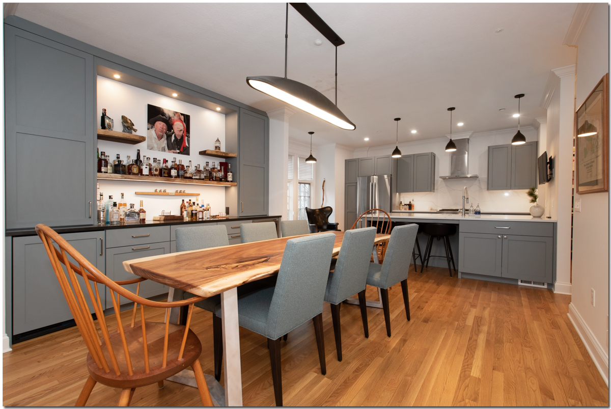
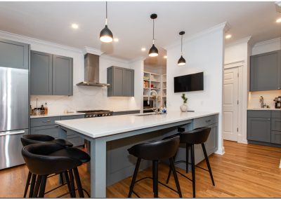
This fifteen-year-old Cleveland townhome not only needed a total update of finishes, materials and numerous repairs, but also suffered from a poor layout. Our firm was hired to take care of all these issues. We worked in every room: making dramatic changes to the kitchen, dining and living area on the main level and the primary suite on the third floor.
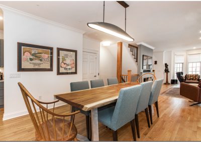
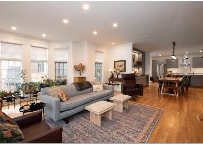
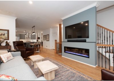
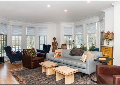
The main floor had an unusual problem: too many windows in the living area. It made the placement of furniture almost impossible. The homeowners wanted a large TV, fireplace and a comfortable seating area. To create the space they wanted, we added a feature wall along the existing stair handrail.
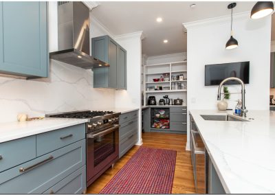
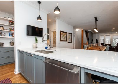
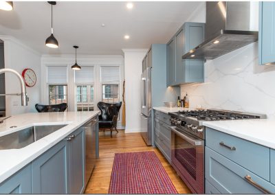
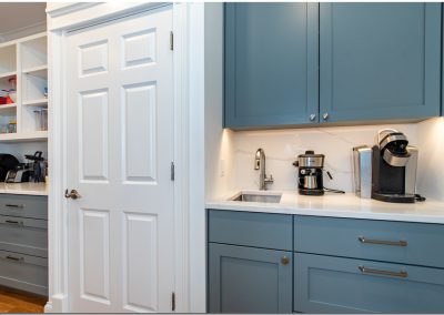
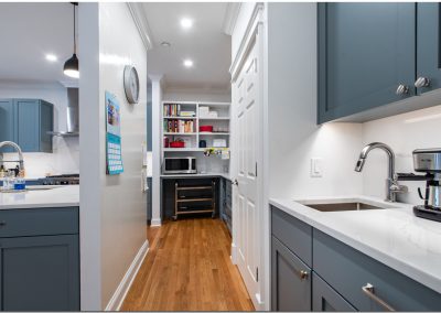
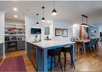
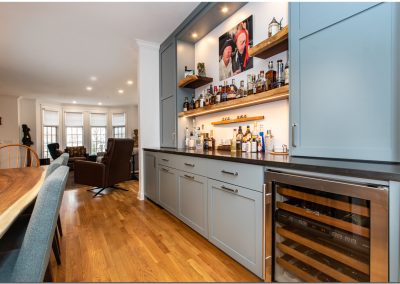
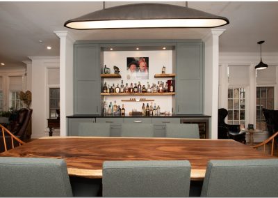
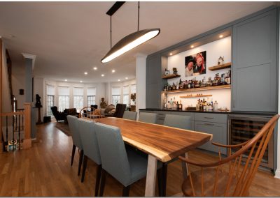
The dining area was dark due to overly large wing walls separating it from the kitchen and living areas, so we cut them back and created a bar/buffet (also on the couples’ wish list). The kitchen had dated cabinets and appliances and felt chopped up. The clients wanted to create a separate but open pantry and coffee area which they love. We took out the tile in the kitchen and continued the oak flooring to further unify the layout.
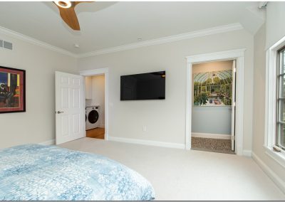
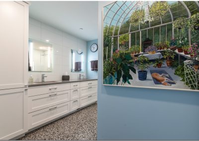
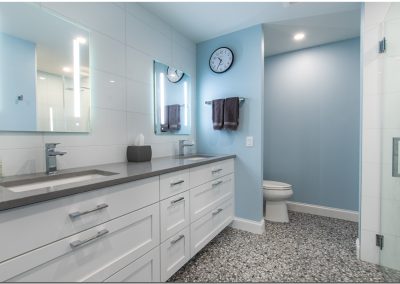
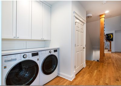
The primary bedroom, bath and adjacent laundry area had an awkward angled wall that complicated each of those spaces. We straightened out the wall and each room became larger. The bedroom gained space on the wall for a TV across from the bed. The bath easily accommodated a large shower and double vanity with storage. And by adding cabinetry to hide the plumbing and utilities, the laundry area could be open to the hall.

